Skip to Content
Project Journey.

FIGR.007 Ha Ha Haus

At one with Nature

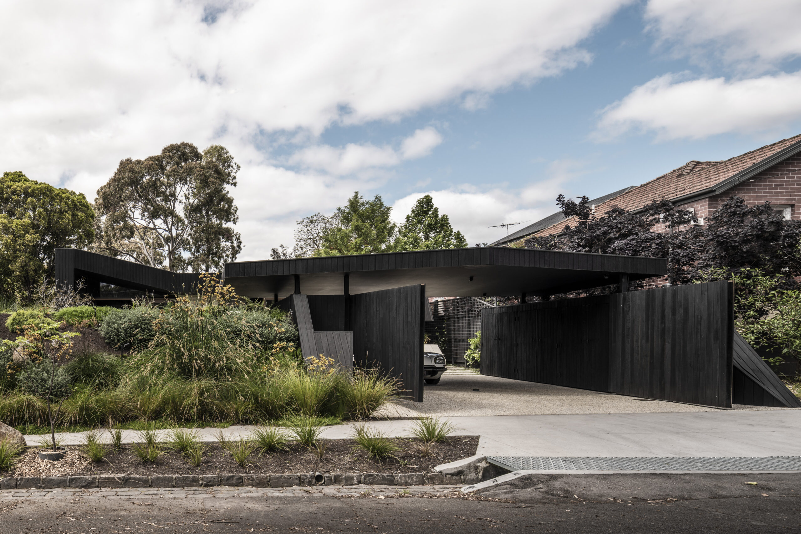
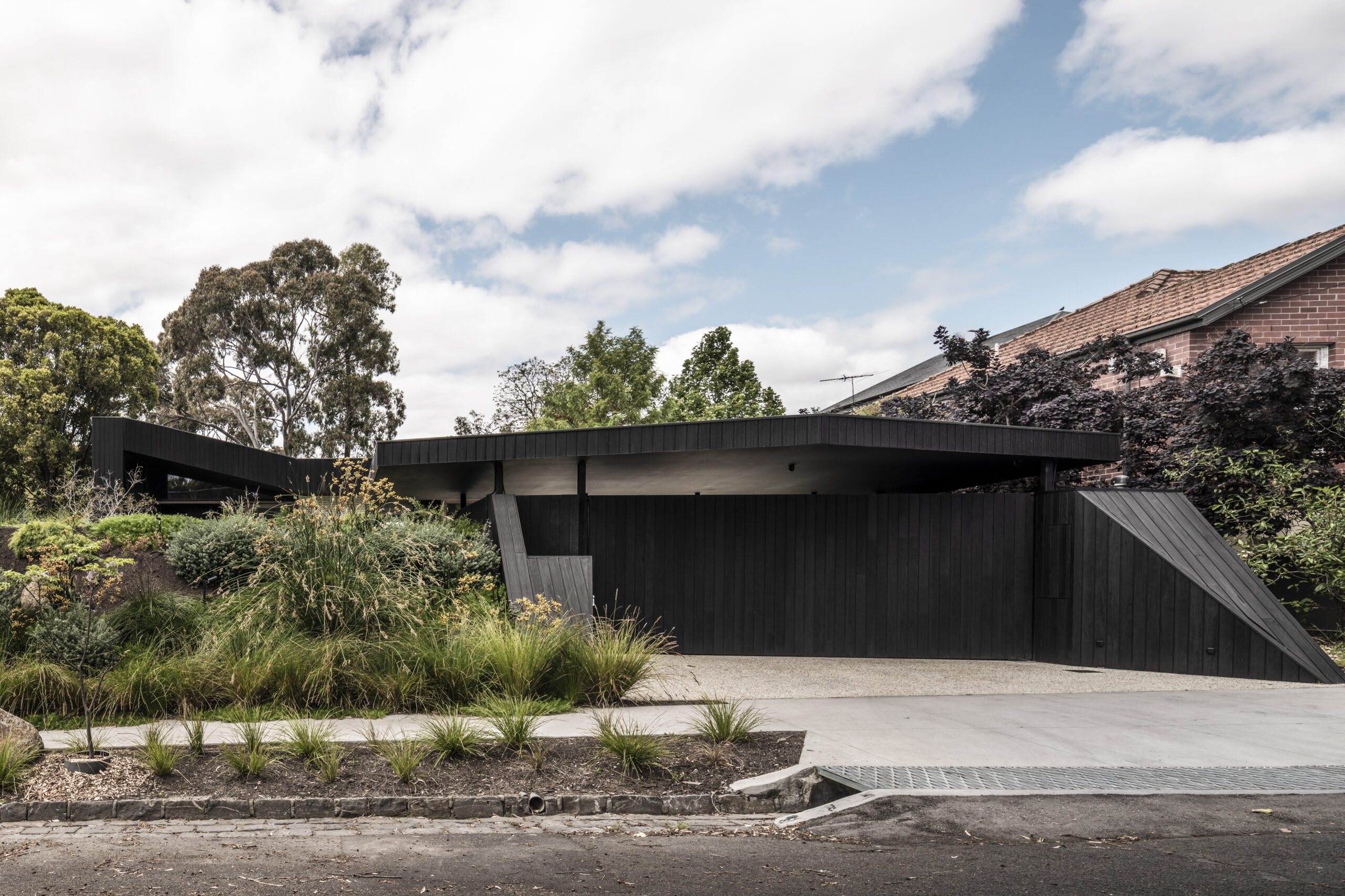
Ha-Ha Wall is a type of retaining wall used to form an invisible barrier. Found on many historic estates, they are a device designed to avoid obtrusive fencing so when the landowners used to look out to the horizon, they couldn’t see where their land ended and where the countryside began. By flipping the plan back to front we adopted the ha-ha albeit that our ha-ha was also one in reverse.

TYPE
Residential Private, New Build

PROGRAMMATIC BRIEF
Bedroom 1 + 2, Guest Bedroom, Master Bedroom, Ensuite, Living Area, Kitchen, Pantry, Dining, Bathroom 1 + 2, Laundry, Mud Room, Study, Retreat, Gym/ Yoga Room, Courtyard, Undercover Entertainment Area.

LOCATION
Alphington, Victoria 3078, Australia

STATUS
Complete

DESIGN AND DOCUMENTATION
12 Months

AREA
245 m2

COUNCIL
City of Yarra

COUNTRY
Wurundjeri

Unexpected Reveal.

TBC

Credits.

PROJECT TEAM
Adi Atic, Michael Artemenko, Barbie Vongphone

BUILDER
Byde Constructions Pty Ltd

ENGINEER
Meyer Consulting Engineers

PHOTOGRAPHY
Tom Blachford

STYLING
Ruth Welsby

AWARDS
Houses Awards 2023 – Shortlisted

Project outcomes.

A process of discovery.

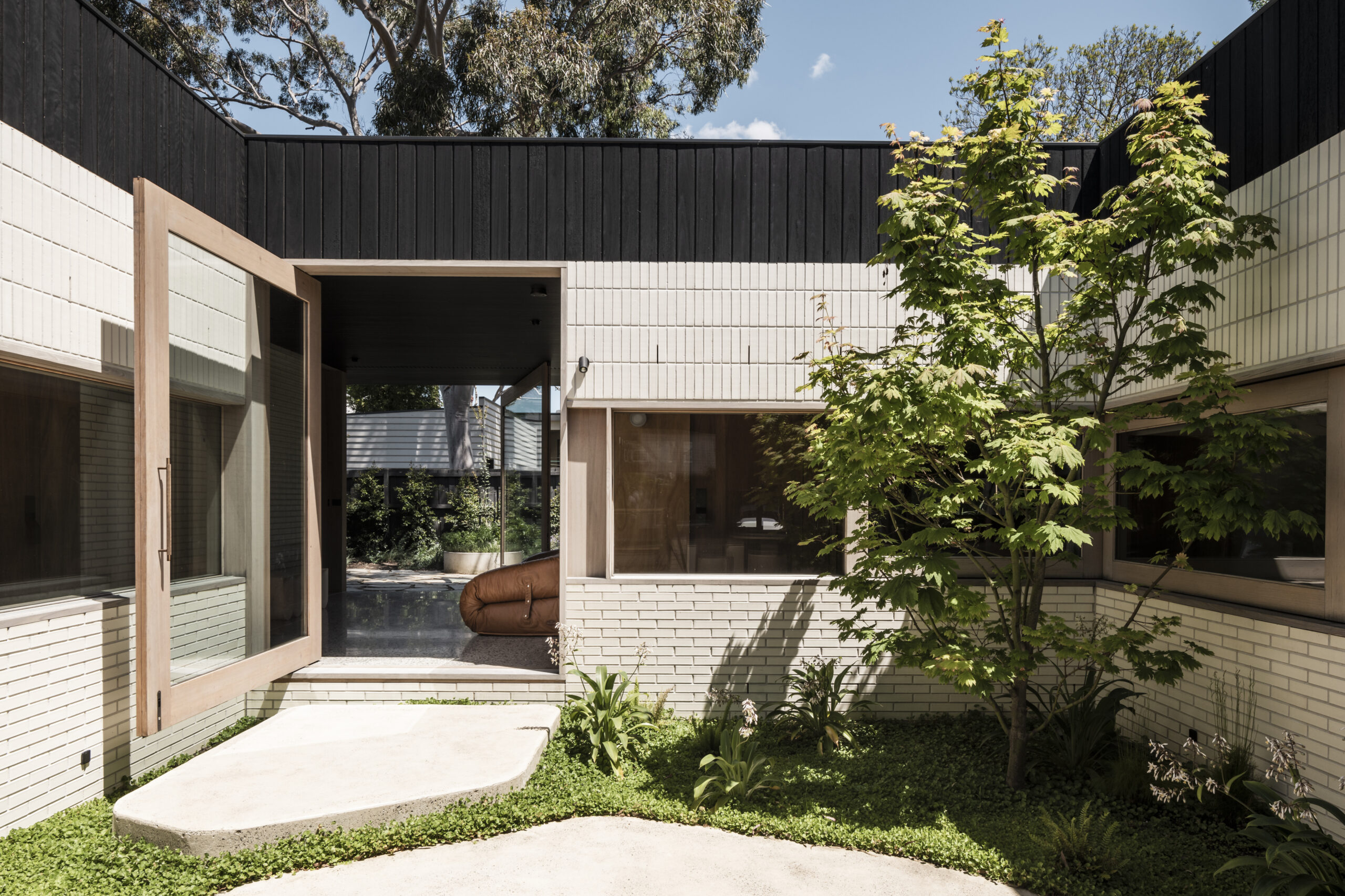
Embedded into the landscape, ‘Ha Ha Haus’ is located in a leafy pocket of Alphington (Wurundjeri country) where front fences are a refreshingly rare sighting. Our client’s design brief was loose in that they were open to any ‘blue sky’ ideas and provided the design meets the core function of a close knit family home which caters for frequent visitors from overseas, intergenerational living and – at times – a transient occupancy.

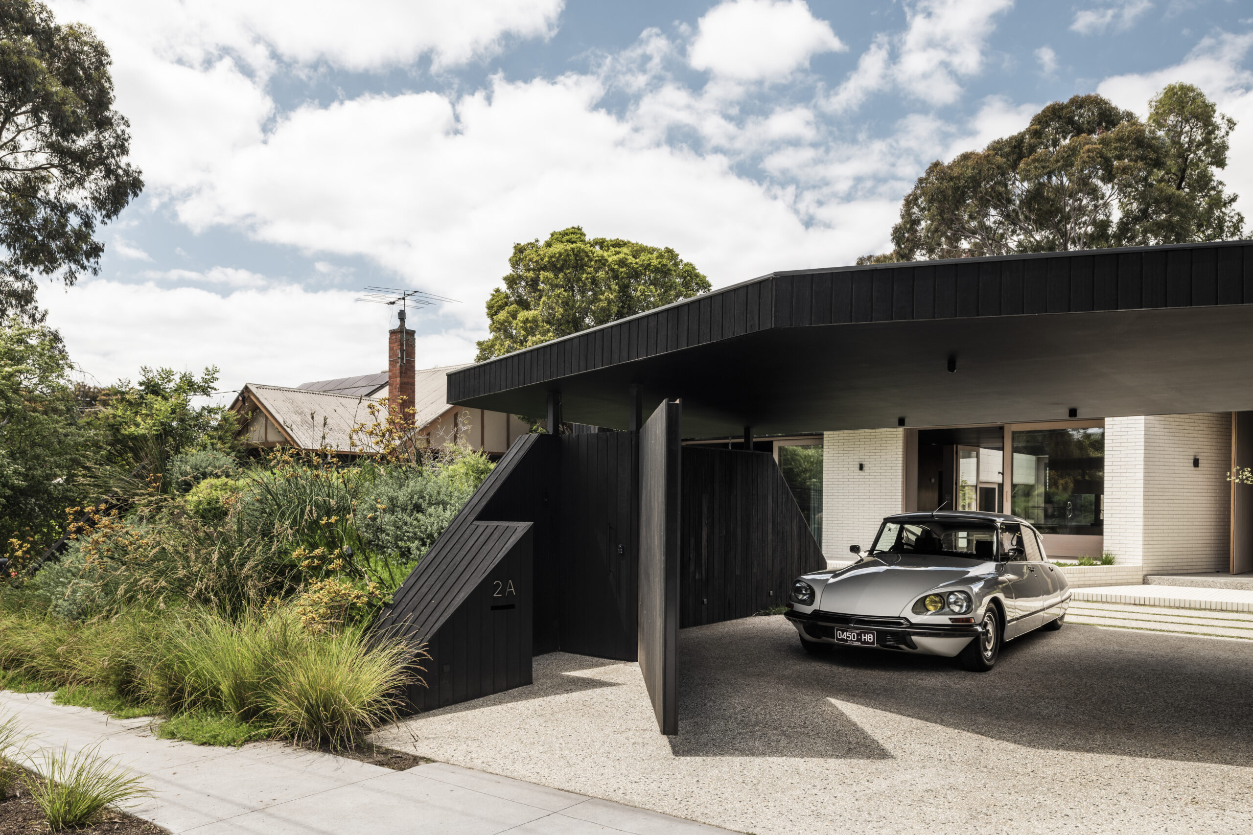
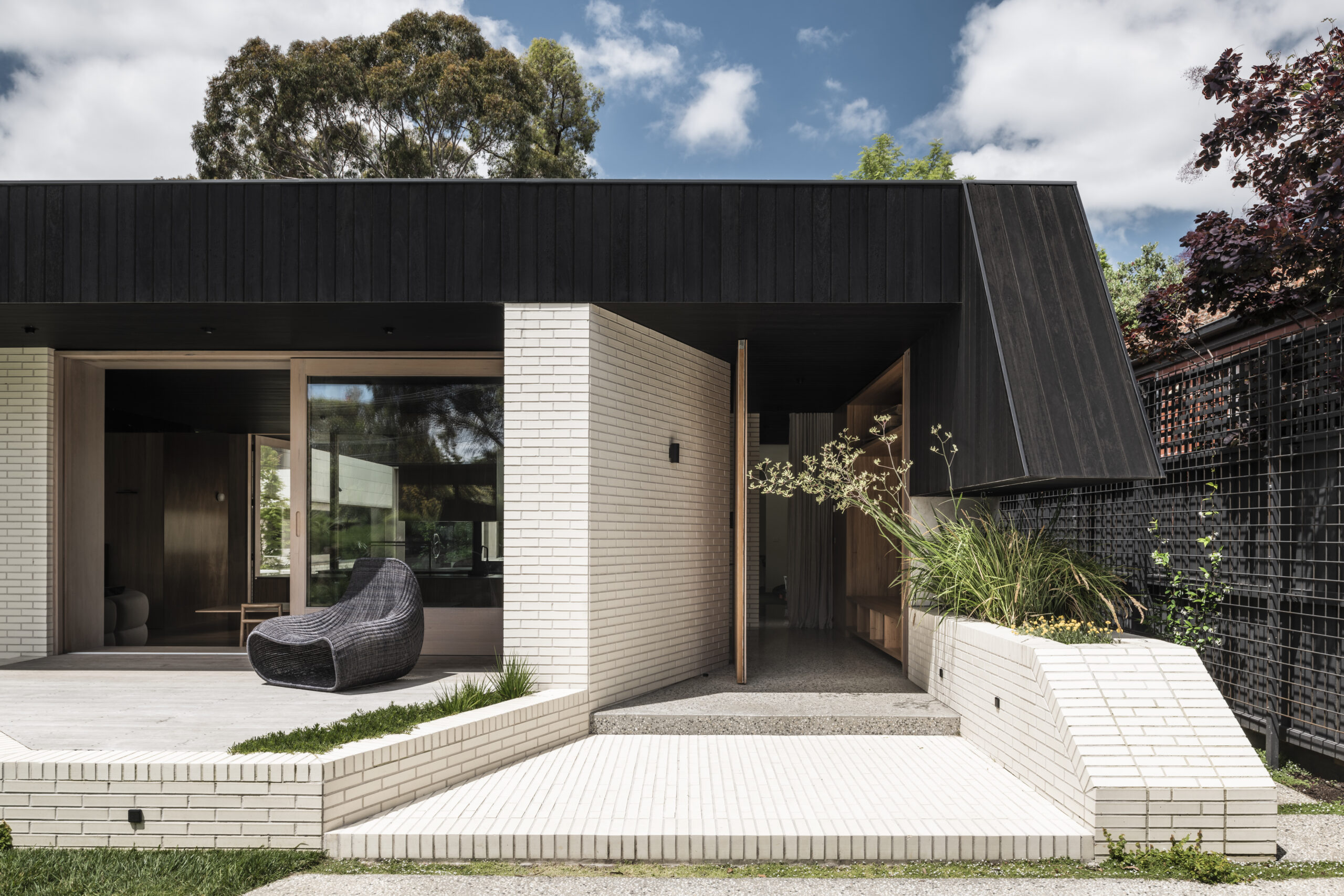
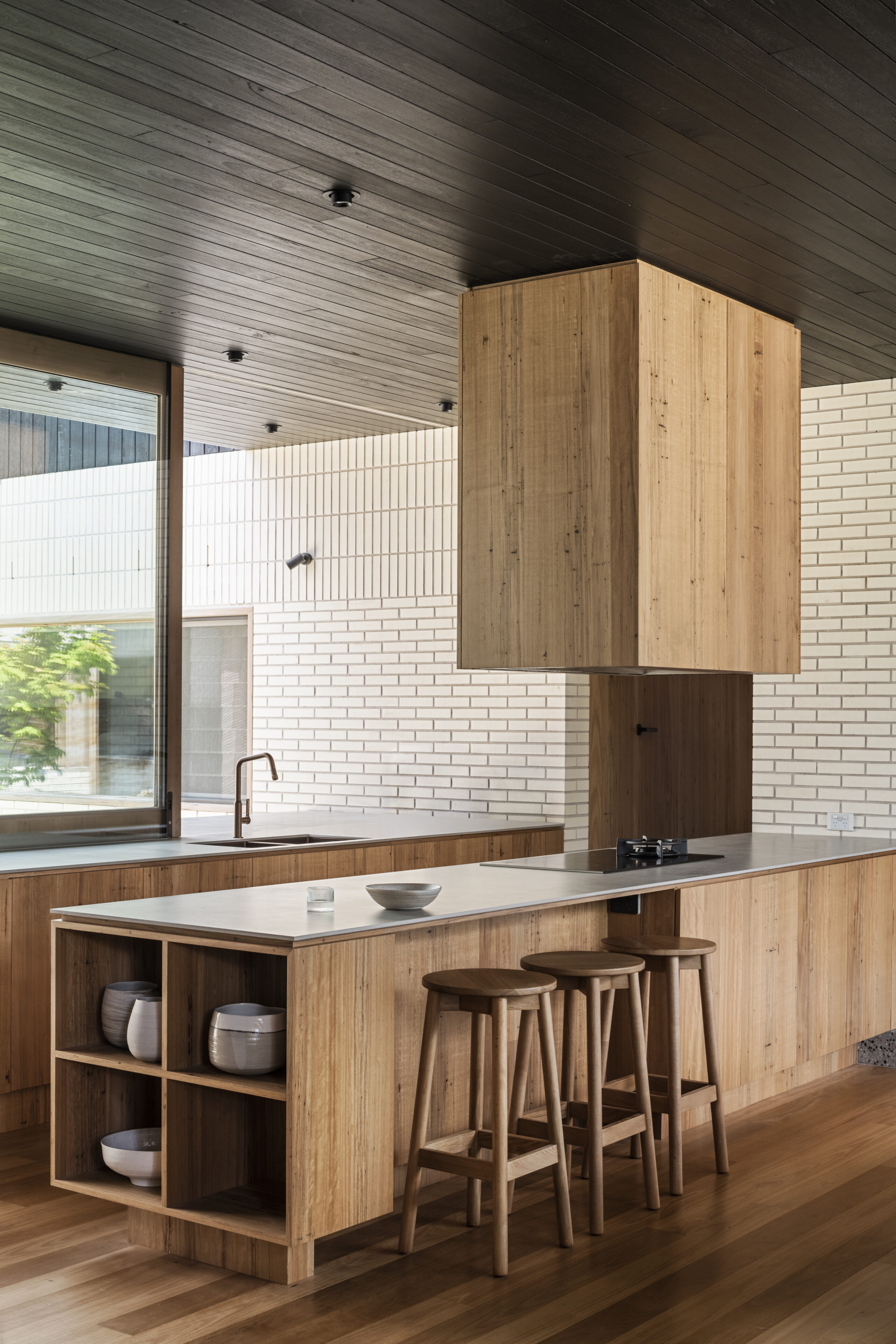
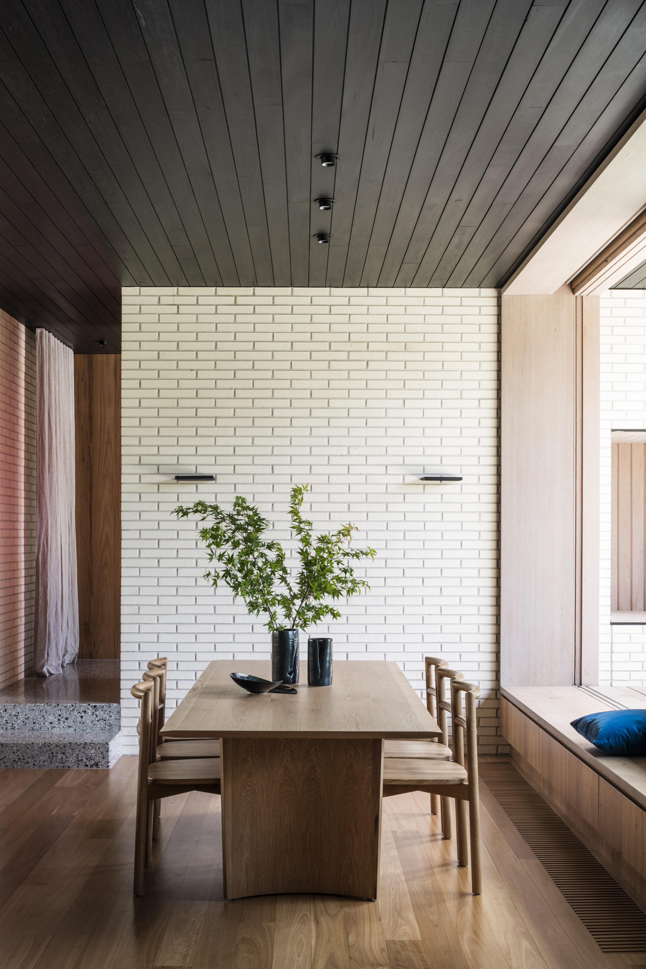
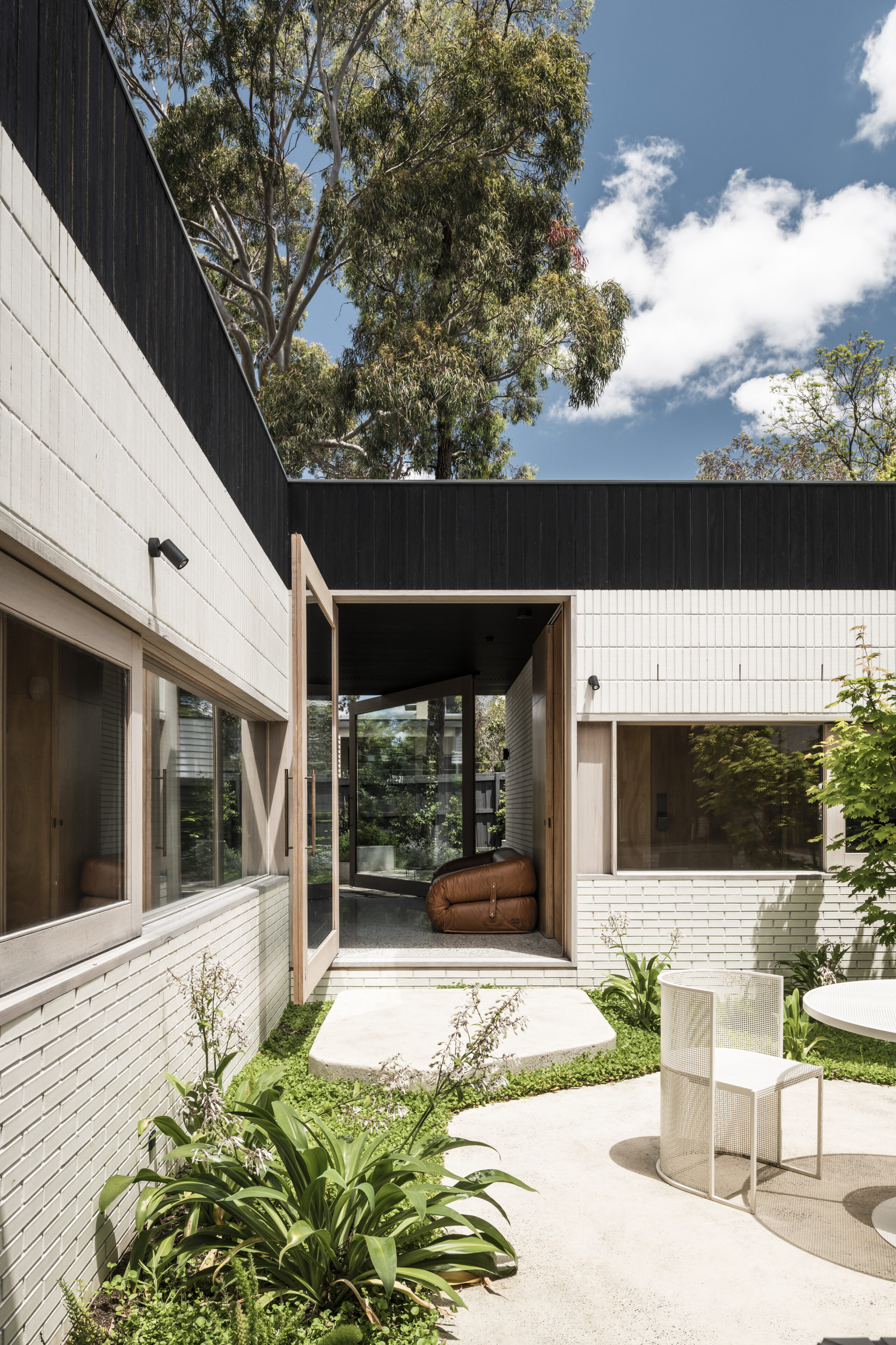
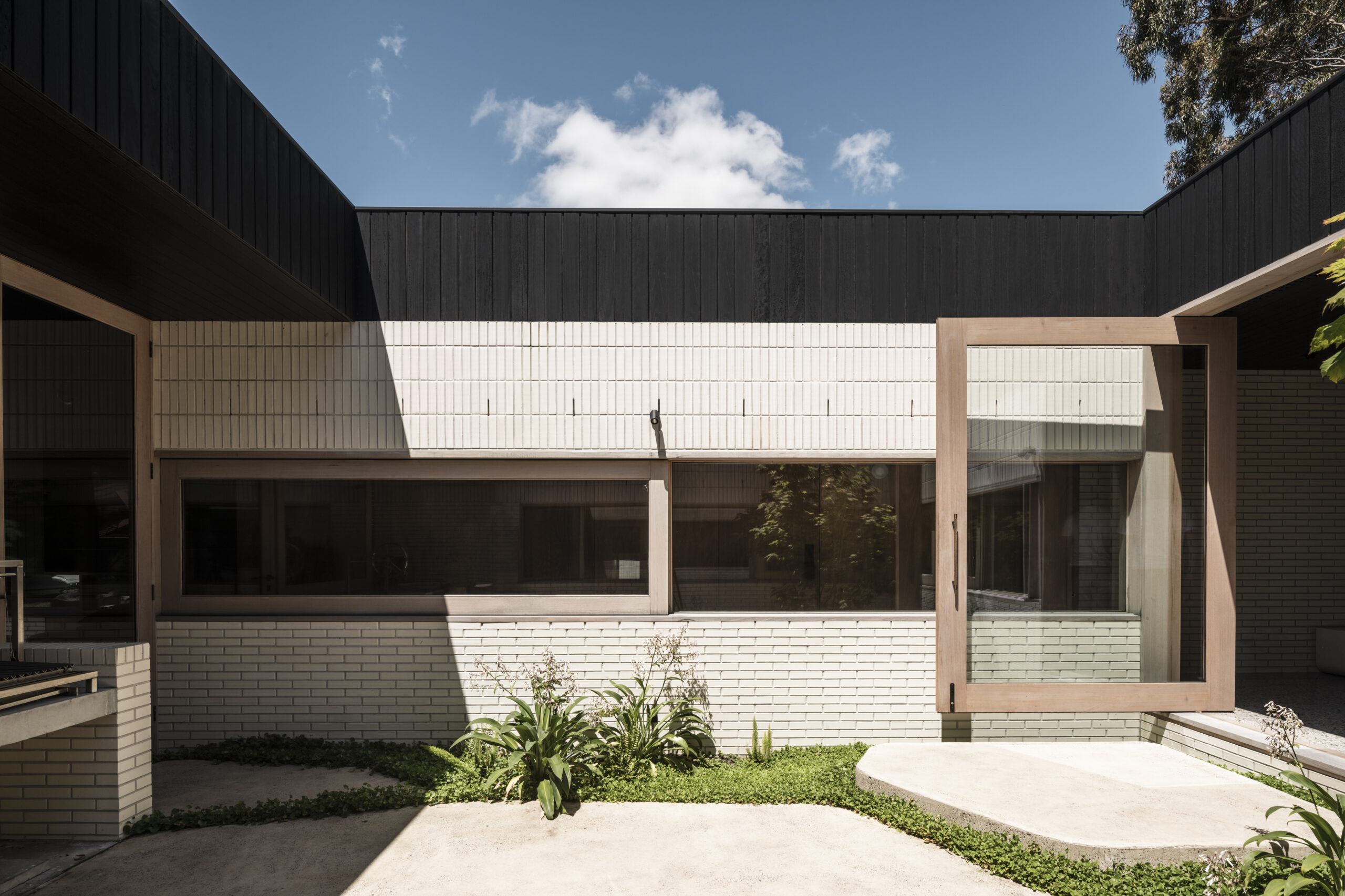
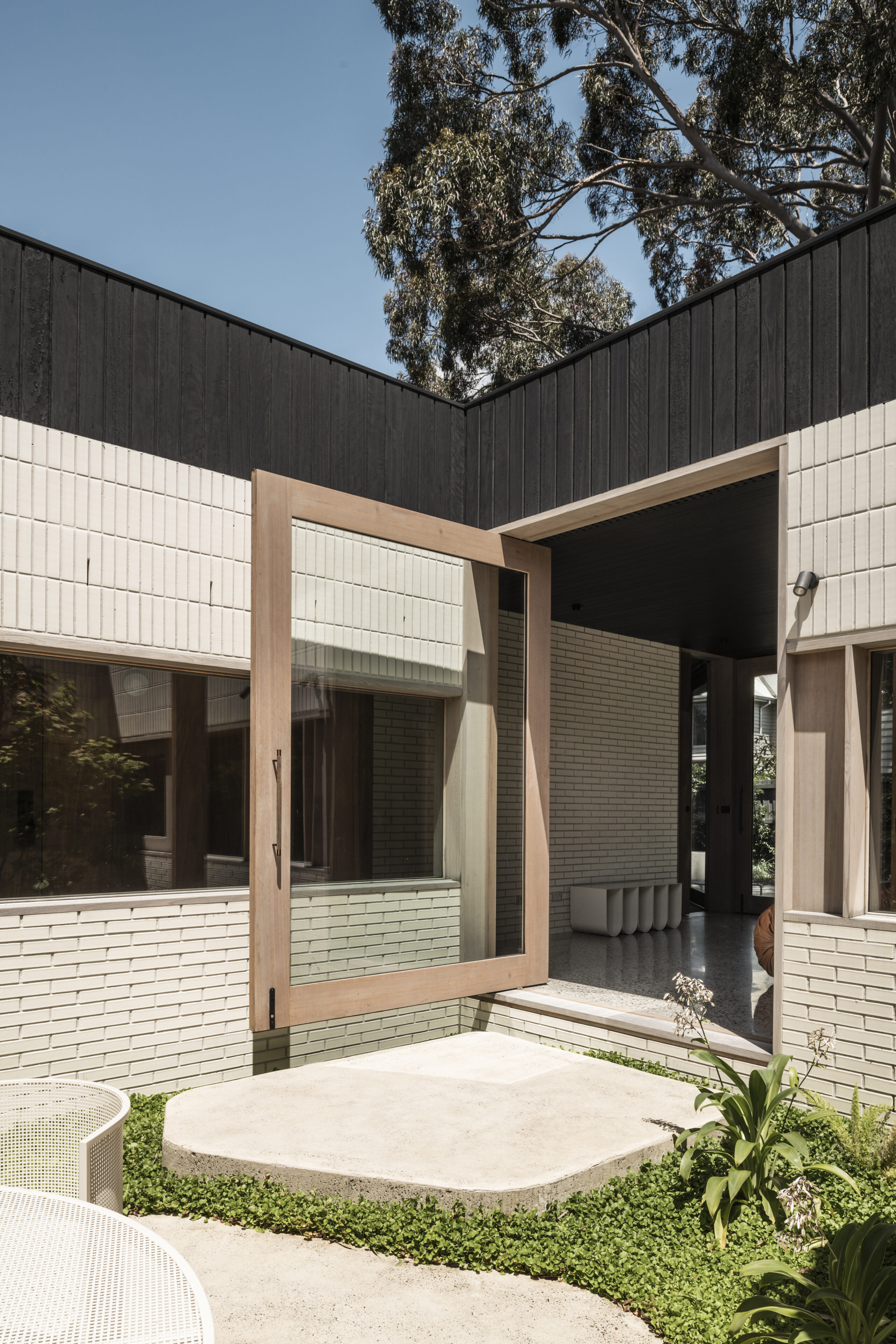
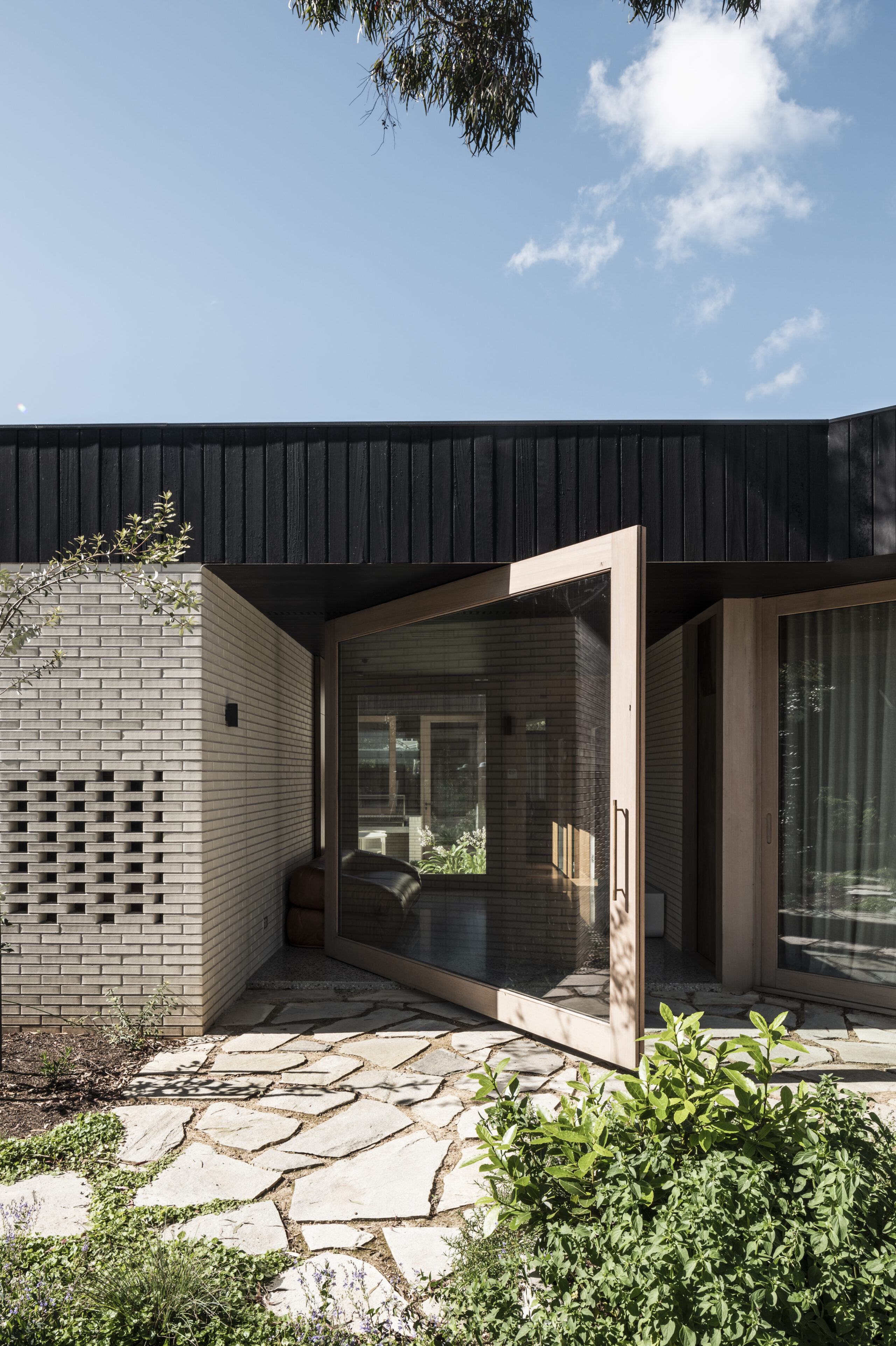
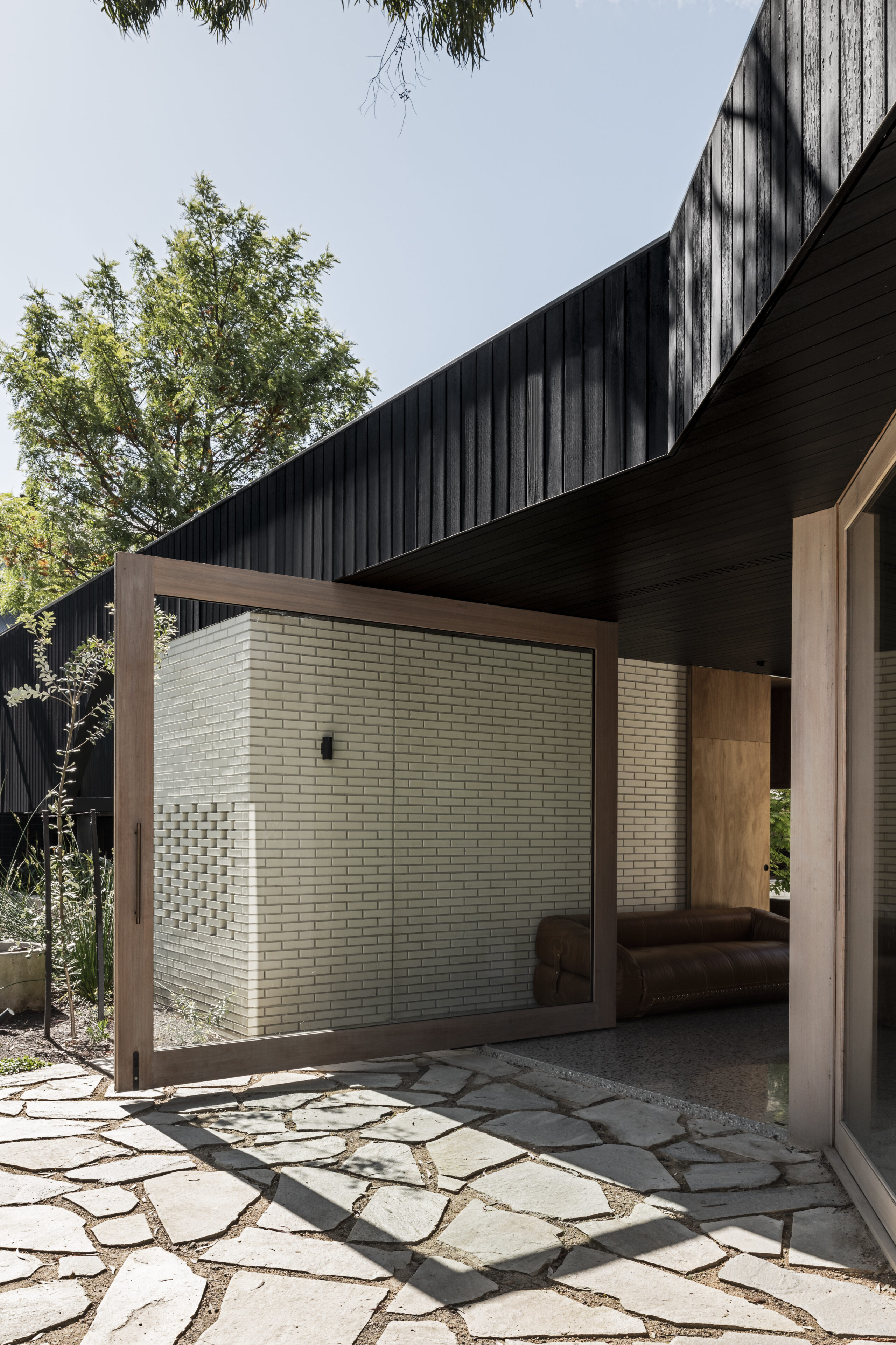
The brick grounds the building and is pushed to various limits in its application as walls, paving, planter boxes and seating. stitching the interior and exterior spaces of the home and signaling thresholds to landscape.

Ideation.

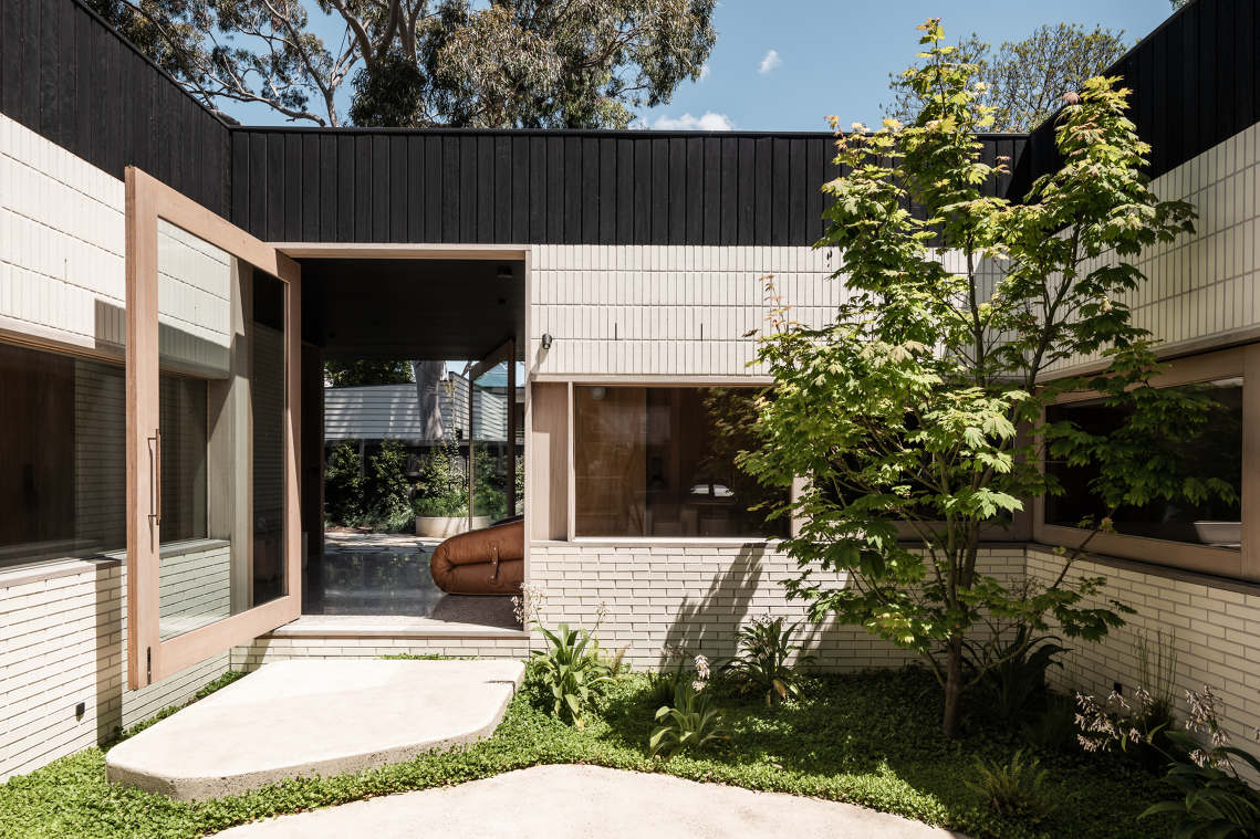
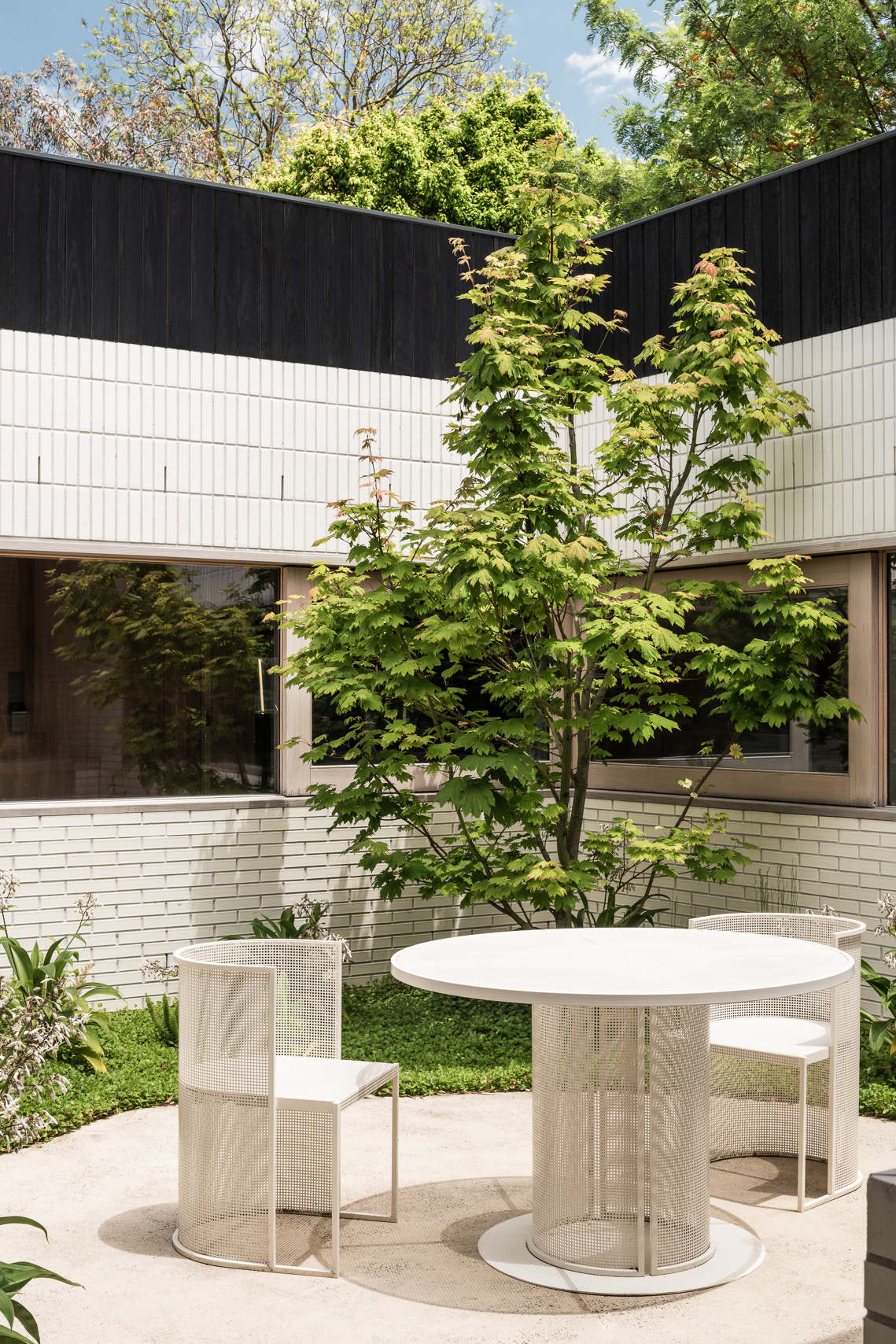
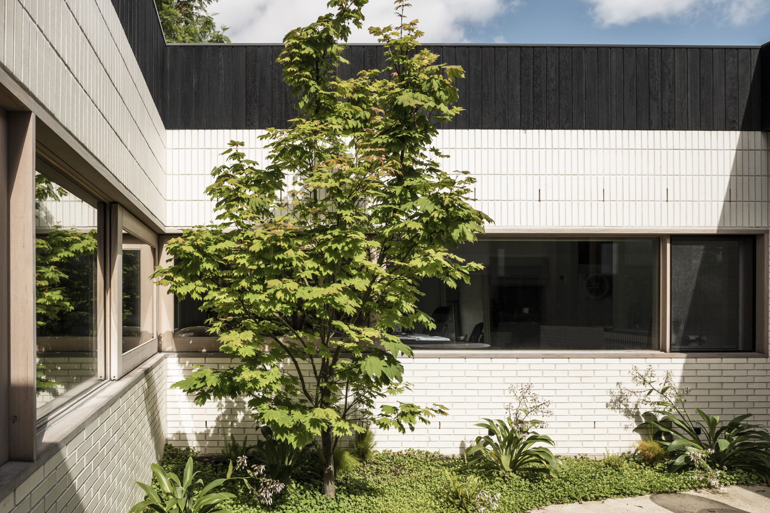
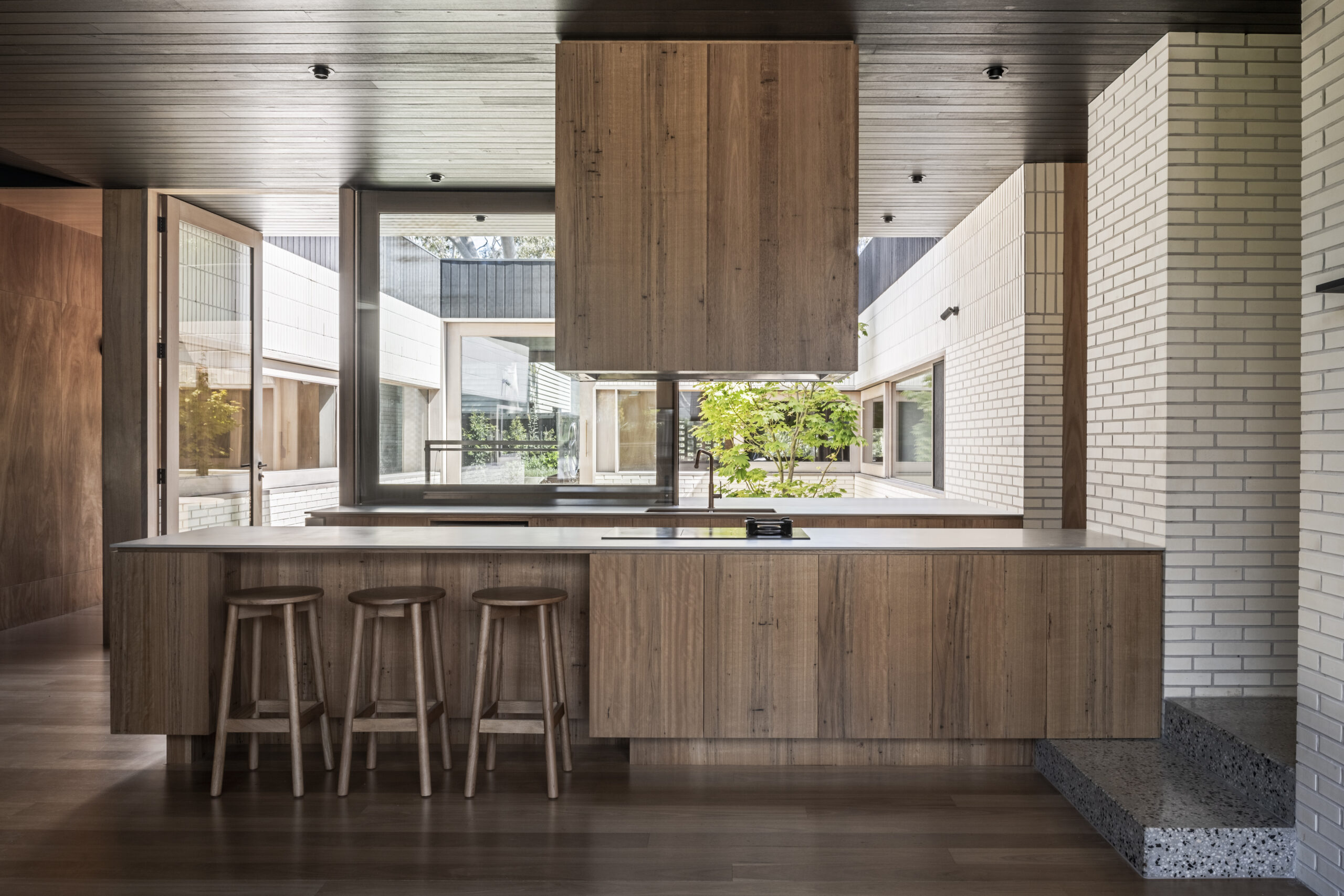
Accordingly, iterative concept testing and close collaboration with consultants and the client resulted in a sprawling single storey design that not only addresses the need for the long term notion of ageing-in-place but one that sensitively responds to the sloping site and the immediate adjoining context. The floor plan itself can best be described as a donut surrounding and enveloping a central landscaped courtyard.

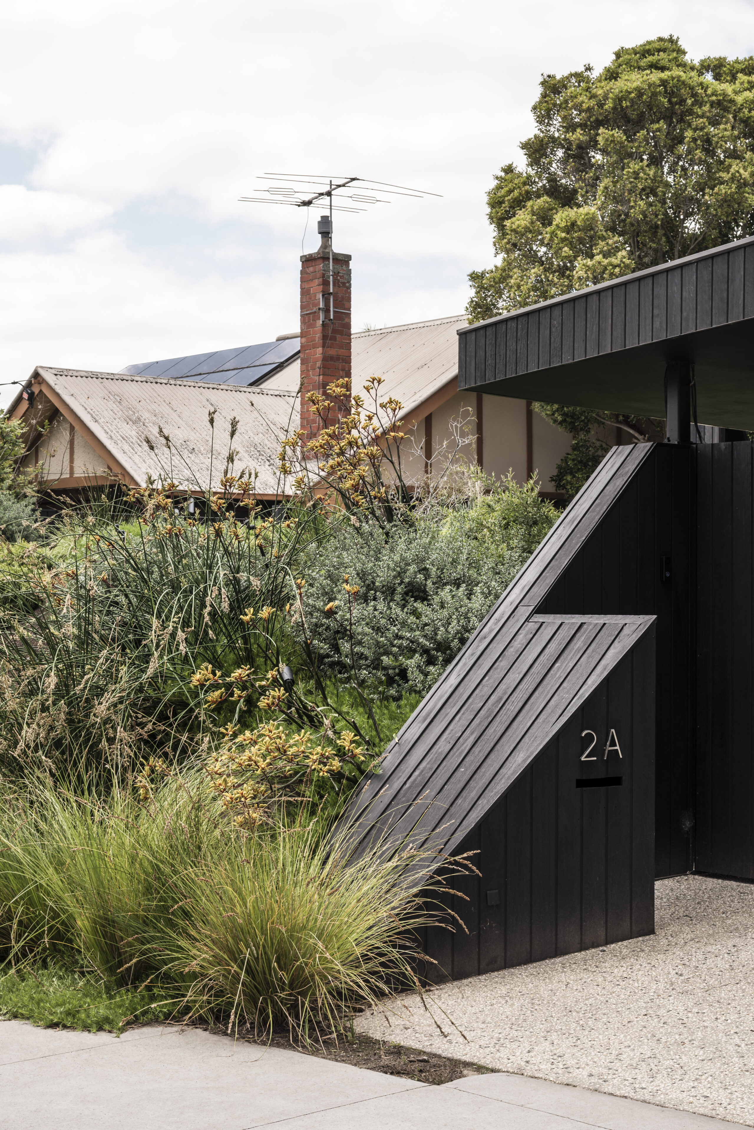
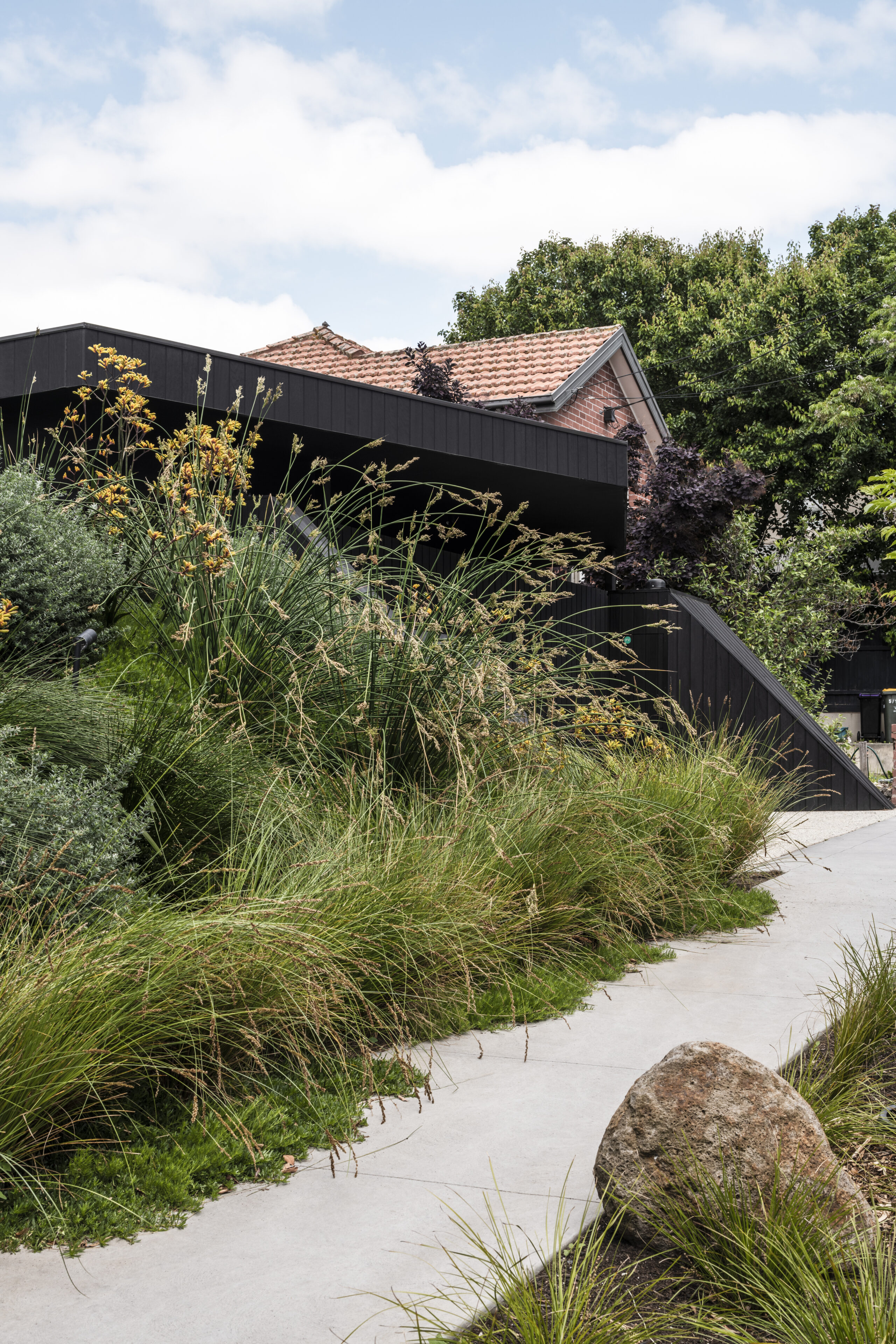
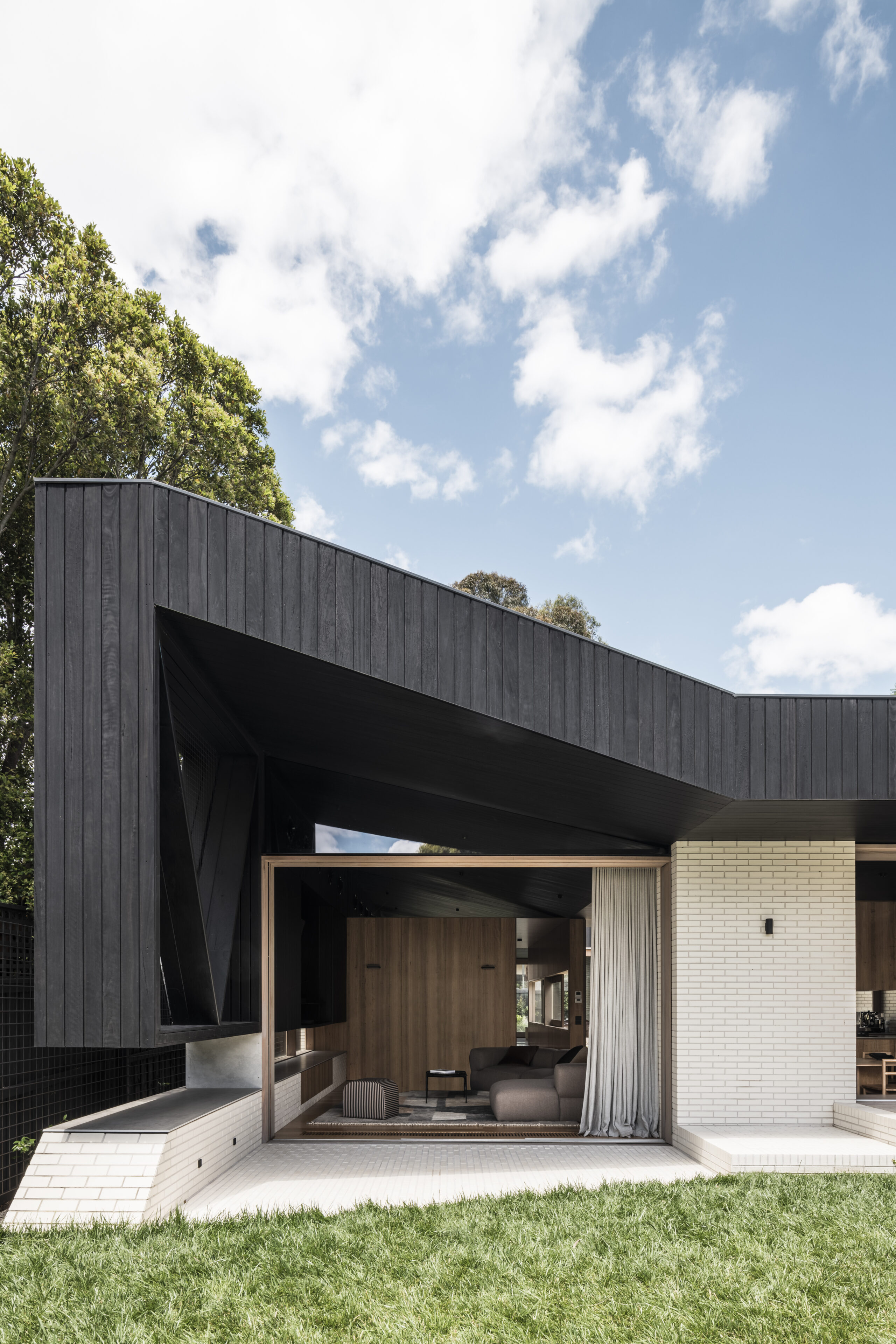
This intentional and key design element is a direct response to fundamental passive solar principles of maximising opportunities of cross ventilation and north facing glazing to what most would deem a challenging site with its backyard facing south. In addition to the sustainability and comfort factors, this internalised outdoor space is place of refuge and acts a mechanism by which the adjoining neighbouring homes overlooking the site are in effect masked out, thereby shifting the perception of the occupant more so towards the beautifully lush borrowed landscape, glimpsed just over the lip of the courtyard perimeter walls. From the footpath, the project aims to give back to the streetscape and public realm into which it is sleeved and embedded. Hence, the namesake, a landscaped mound beguiles and conceals not only the necessary visual bulk of a low lying house, but a 20,000L rainwater harvesting tank, which with the advice of our repeat landscape collaborators Mud Office, serves to provide recycled water for irrigation and bathrooms ten times that which is required by local building regulations. A large single storey roof catchment means that there is plenty of rainwater not going to waste. Set in and around this mound is a charred Blackbutt timber clad veil which in a way generates its own horizon line and acts as a heat trap. This native Australian timber cladding, like the other building materials extends from outside into the internal parts of the home. The palette intentionally paired back to three main finishes which were locally sourced to limit embodied carbon emissions, and selected for richness, robustness, longevity, and low maintenance characteristics.

Craft.

The project explores three materials in tension with each other. the brick plinth and pillars propping up a charred timber veil that are dissected with natural timber symbolizing the thresholds and signaling the apertures between programs and outdoor zones. Adjustments in geometry are exercised both in plan and section. These Tweaked edges are adjusting for the apertures as you move from internal zones into the landscape.

"materials in tension."

Credits.

PROJECT TEAM
Adi Atic, Michael Artemenko, Barbie Vongphone

BUILDER
BYDE Construction Pty Ltd

ENGINEER
The Meyer Consulting Group

PHOTOGRAPHY
Tom Blachford

STYLING
Ruth Welsby

AWARDS

2023 Inside Out’s Home Of The Year, Best New Home Build, Winner

2023 Houses Awards, Category Sustainability, Shortlisted

2023 Houses Awards, New House over 200m2, Shotrlisted
 

Loader